
I love eating. I mean, I really love it. Especially hamburgers. I am a hamburgerholic.
I remember one time I was so excited when I found out a new burger joint opened up on my street. So close to me! It would be my personal hamburger “Cheers”. I would walk in, everyone would shout my name, and I would be served my favourite burger. Life would be good in my new found hamburger heaven.
You can imagine my disappointment when I didn’t get my burger for over an hour after I ordered it. On top of that, it was cold, the waiter was a jerk, and no one seemed to be even remotely as enthusiastic about hamburgers as I was.
So when do you think the next time I went back was? Never. Do you think I recommended this place to any of my friends? Not a chance. My experience was so poor, I was actively rooting for them to fail.
You are the hamburger joint, and I am your user. If you frustrate me, irritate me, confuse me or take advantage of me, my experience with your product will be so bad, I’ll head for the hills and never come back.
I won’t tell my friends about you. I won’t subscribe to updates from you hoping you’ll improve.
This is how important the usability of your product is. You want to actively create a positive user experience for every single user.
Positive user experiences lead to more sales, increased word of mouth, higher engagement rates and faster growth.
In order to help your create happy users, I’ve put together this list of 10 quick fixes for common usability issues that can be corrected within 5 minutes each.
1. Write Good Page Titles and Descriptions
People want to find your product. You don’t always need to be shoving it in their faces with ads and growth strategies. If you’re truly solving a problem that a lot of people have, there are thousands of users searching for you right now.
If you don’t have a page title or meta description, they’re not going to find you. Ever.
Picture this, a person types into Google, “How to Potty Train your Cat”. They get a list of results, and you’re lucky enough to rank in the top 10 of results for you cat potty training product.
Below you, is your competitors product. You’ve chosen to neglect writing great page titles and meta descriptions, but your competitor hasn’t.
The person looks at your page and sees “Cat Potty Training”. Then they look at your competitors and see “Learn to Potty Train your Cat in 5 Days – The Easier and Most Effective Method Ever Created!”
Which one would you click on? Exactly.
Take 5 minutes to write a title and description of your product. How hoes this improve user experience? Because your users are actually able to find the solution to their problem… Your product!
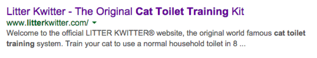
Litter Kwitter wastes page title and description by bragging about how they are the original training system. So what?
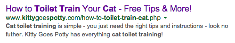
Kitty Goes Potty does a great job of explaining the benefits and selling me on their product. Now I’m a happy user since I feel this is the best choice I can make.
2. Use Different Terms for Sign up and Sign in
Imagine instead of red and green meaning stop and go, it was red and purple? How confusing would that be?
Would you really be paying that much attention that you took a moment to make sure that was purple you saw and not red?
Probably not.
Users aren’t very attentive either. Sometimes they only read the first half of a word and their brain takes over from there, assuming they already know what it is.
If I showed you the word “sign” on a button, you could assume that button meant sign up. You could also assume it meant sign in.
Using “sign in” and “sign up” side by side causes confusion and frustration in your users, since some of them only read the word “sign”.
They’ll often click on sign up, mistaking it for sign in, and get frustrated with being directed to the wrong place.
Instead, try using two different terms that are very easy to tell apart at first glance.
For example, “Register” and “Login” or “Sign up” and “Login”.
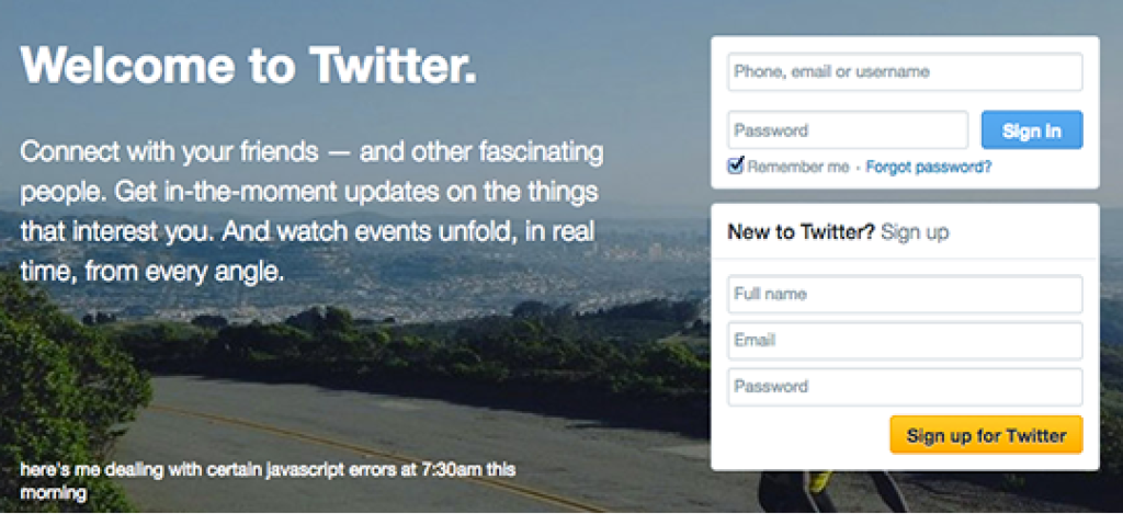
Twitter uses both “Sign In” and “Sign up”, although in two separate boxes, still not a great UX decision.
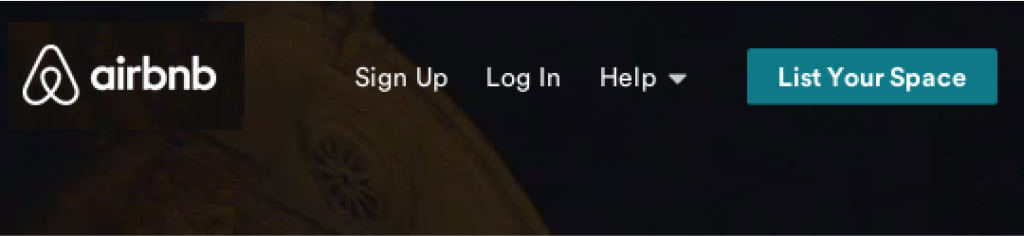
Airbnb, on the other hand, uses “Sign Up” and “Log In”. Two easily distinguishable terms, even with just a quick glance.
3. Don’t Ask for Credit Card Information for a Free Trial
Here I am, super excited to try out your product.
You’ve sold me on the idea, and I’m so sure you’re exactly what I’ve been looking for.
I’m going to sign up, give you my credentials and dedicate some time to trying our your service.
I am an extremely hot lead right now. I’m the molten lava of hot leads. But then you go and ruin it all by asking for my credit card.
This is a huge violation of our trust. You told me I could try this thing out for free, but giving you my credit card doesn’t sound like it’s free at all.
Even if no money is exchanged, I’m still over paying you with too much information.
Now I’m pissed off because I’ve already dedicated a bunch of time filling out all my personal details.
You’re not losing anything by offering people a trial of your software without their credit card.
You’ll still get their email, which is the biggest asset of all. If they’re free trial runs out, launch a drip email campaign offering them discounts and exclusive offers.
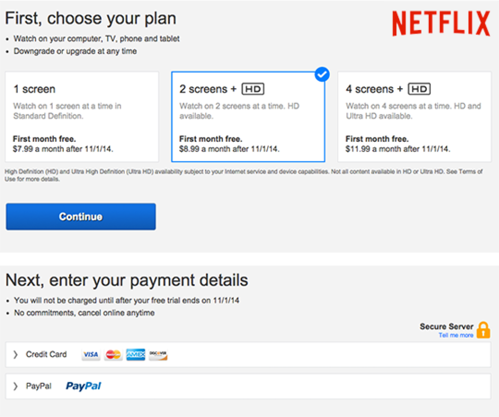
Netflix, regardless of how awesome, requires payment details to take advantage of their free trial. Sad face, sad face, sad face.
4. Label Interactive Controls With Words or Icons
You know those knobs on your car stereo?
Off the top of your head, do you know which one is volume and which one changes the station? It’s different on every car isn’t it?
How much do you want them to just have a little label that says “volume” and “frequency”?
Even a couple of little icons would be good enough for me.
This way, when my jam comes on the radio, I can crank up the volume instead of accidentally changing the station.
This is a lot like not labeling elements that users interact with to control your interface.
For example, if I can click on the background to add a new item, make sure a “plus” icon appears when I hover over it.
Don’t assume that your users will understand how to use a function once they realize it’s there.
You need to show them it’s there every single time.
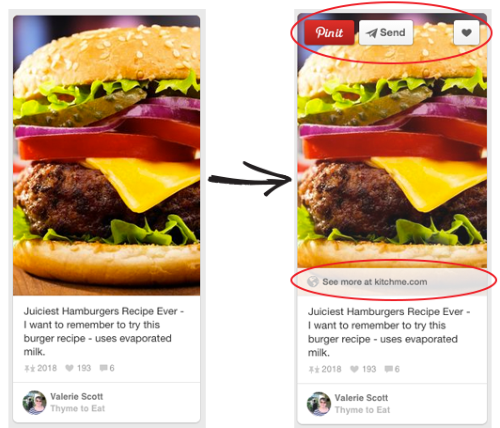
Pinterest’s hover controls are perfect. At first glance, you really have no idea how to re-pin something. Upon hovering, all the controls appear and are well labeled with text as well as icons.
5. Highlight the Most Common Choice
Users are always being presented with choices.
“Are you sure you want to continue?” is one you see all the time.
It’s often used to confirm that a user meant to do a more permanent action, like delete something or exit a program.
This is a good thing, because accidentally deleting something sucks. But almost 100% of the time, the user has meant to click on “delete”.
This confirmation message can sometimes become a little irritating, so make it easy for users by highlighting the choice they most commonly choose.
In this example, the user would be presented with a pop up box with two choices, NO or YES.
Make the “YES” button more visually heavy, by giving it a strong, bright contrast color.
This makes it that much easier for the user to choose what they wanted to do anyways.
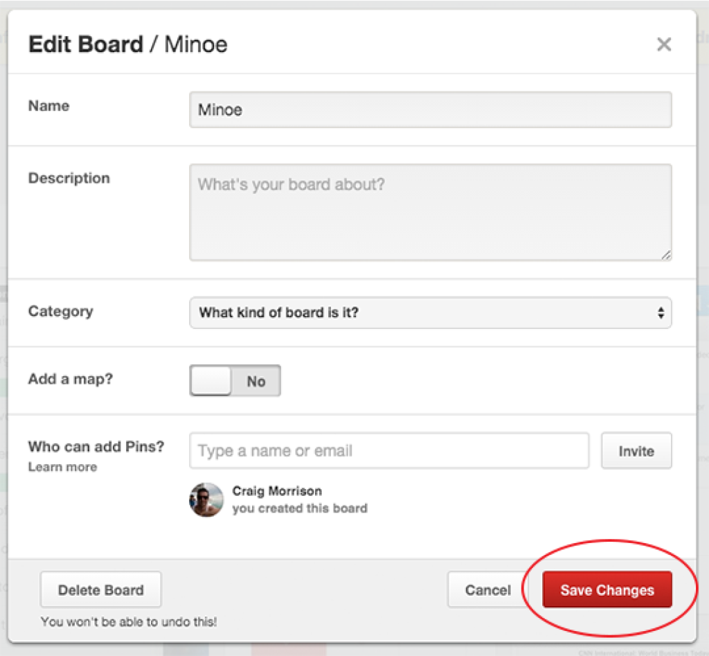
When editing a board on Pinterest, the most common choice afterwards is to save the changes. Since 99% of users are looking for this option, it appears as the most important and obvious choice.
6. Save Form Content If the User Makes an Error
You know what sucks? Filling out forms.
Even if your forms are the cleanest most simple forms around, filling out forms still sucks. Let’s establish that.
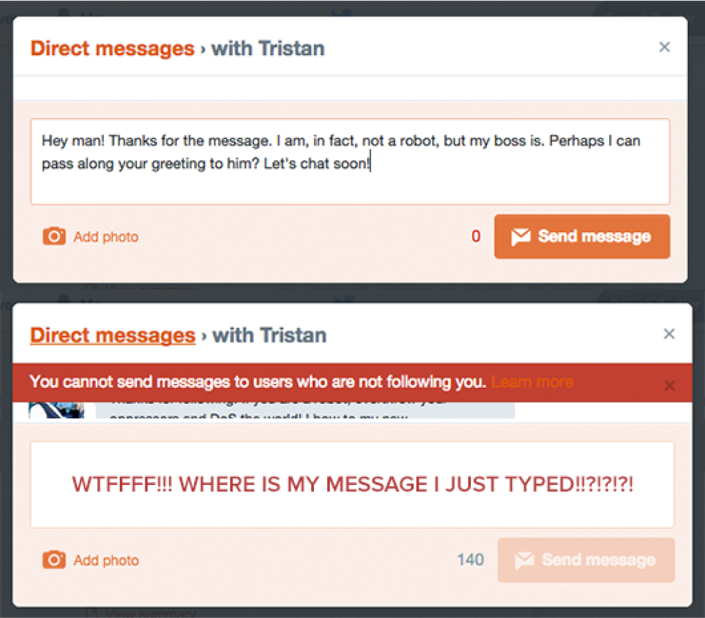
Now, you know what sucks even more? When you spend a solid 5 minutes filling out your user details like email, contact, password, etc. and you hit save, only to discover you’ve made an error.
Not that big of a deal right? Not normally, but then you realize what happened.
When the error message popped up, it reloaded the page and cleared all of the information you filled in.
NOOOOOOOOOO!!!!
Most of the time when this happens, I just leave. Unless I was signing up for something really important, I am too frustrated to fill out everything again.
Make sure that any information that a user fills out doesn’t get erased when they get an error message on submission.
This goes for the login screen as well.
If I enter my email and I hit a login error, leave my email address or user name there and erase my password.
I’m most likely going to retry my password 4 or 5 times, so you’re saving me a lot of time and frustration.
7. Use the Correct Line Height
Have you ever come across a site that just seemed hard to read?
That was probably due to improper line height. Line height is the amount of white space between each line of text on your page.
This is an extremely important part of the readability of your site, and often overlooked.
Line height increases based on two factors, the size of your font and the width of your lines.
The bigger the font, the more line height is required to create the correct amount of whitespace between lines.
With wide lines of text, white space is required to make it easy for the reader to be able to “wrap” their eyes back to the beginning of the next line.
Without the correct amount on whitespace, the reader might start reading the wrong line.
The mathematical equation for determining the best line height is confusing, so check out Personified’s Typography Calculator to calculate your perfect line height.

An example of a paragraph with proper line height.
The same paragraph as above but with too small of a line height.
8. Use Placeholder Text in Your Form Fields
Forms suck, have we covered that? No one likes filling them out.
They’re boring, time consuming, and most of them want too much information.
As a user, I want to blast through any forms you present me as quickly as possible with no friction what so ever.
I don’t like getting stuck, or confused about what you’re asking for, not even for a split second.
A big help for users is to simply enter placeholder text in the empty fields.
That could include a short statement about what they’re supposed to enter there, or even just an example of what you’re looking for.
For example, phone numbers can be written in a variety of formats. They could include brackets around the area code, or the country code before the area code.
Either way, you’re not going to include all of this information in the label of the field. Instead, put an example of the phone number format you’re looking for in the empty field.
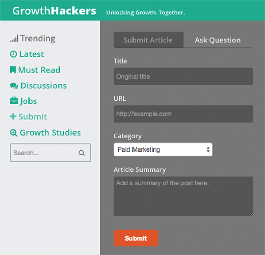
GrowthHackers offers the user help with a bit more direction on filling out the submission fields.
9. Perform At Least One User Test
People think of user testing as an extensive process which requires interviewing hundreds of users, recording their behavior, and drafting up some monumental report on usability.
It doesn’t have to be.
Did you know that a majority of your usability errors can be found with a single user test?
It doesn’t hurt to hold four or five more just to be sure, but chances are you’re going to find the same problems with the other users as you did with the first.
This might sound time consuming, but it really isn’t.
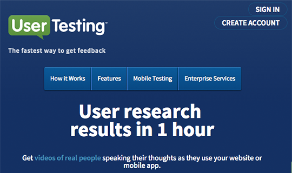
UserTesting.com is a site which offers live user testing of your site, returned to you within an hour. We took advantage of this at my last startup and it helped enormously.
A single test will run you about $50, but it can be as long as you want.
You specify the type of user that matches your user base (female, mother, salary range, etc.).
Set up as many tasks as you want them to perform, and watch them perform them on a recored screen capture video.
They also have a free 5 minute option you can take advantage of at Peek by UserTesting.com
Just to be clear, none of these are affiliate links and I don’t get paid to send any traffic their way, I just think their service really needs to be taken advantage of by more startups.
10. Use Less Navigation Options
Pop quiz hot shot, how many items can the short term memory hold?
SEVEN!
Navigation that contains more than seven items means your users can’t hold all of the options in their memory.
That means finding what they’re looking for becomes much more difficult.
It’s kind of like going to a new burger joint and scanning down the huge menu of burger options. By the time you get to the bottom, you need to start over again.
On top of this, the more options you have, the less important each one becomes.
If I really want you to buy the premium plan of my SaaS, but I’ve got the purchase link buried amongst twenty other options, than no one is ever going to see the most important link in my navigation.
Simplify your navigation by including seven options or less.
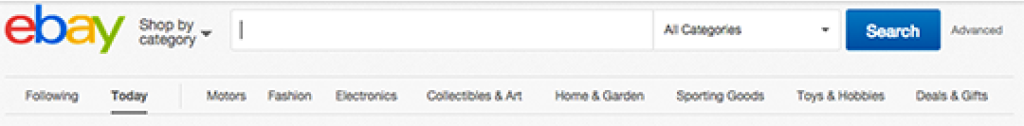
Ebay has too many options in their navigation for a user to be able to remember what they read at the beginning. The fact that they are all drop downs makes things even worse.

On the other hand, Amazon has it’s menus broken up into smaller sub menus, each containing about 4 – 5 items. A much better setup until you realize they are also ALL drop down menus.
11. Let’s Summarize
Now that you’re aware of how to spot these simple UX mistakes, dedicate 5 minutes to fixing each one that you’ve overlooked with your product.
Creating positive user experiences is the key to retaining users, increasing sales and having your product spread like wildfire.
Once again, here is the list of 10 quick fixes for simple UX problems:
- Write good page titles and descriptions.
- Don’t use Sign Up and Sign In together. Vary the terms.
- Don’t ask for a credit card for a free trial.
- Label all interactive controls.
- Highlight the most common choice.
- Save form content if the user gets an error.
- Use proper line height for text blocks.
- Use placeholder text in form fields to guide users.
- Perform at least one user test.
- Use 7 or less navigation items.
Wanna download the PDF eBook of this post? Click here.